CSS3, along with HTML5, is quickly shaping up to be one of the most exciting and useful Web technologies in years. In this article, I will be explaining some of the new graphics-rich techniques and properties available with CSS3. You will learn what is likely to be approved as part of the final spec, what is still a work-in-progress, and how to deal with cross-browser incompatibilities and lack of support in older browsers. Ready? Here we go.
Introduction to CSS3
CSS3 is a collection of modules that extend the previous CSS2 specification that we all know and love. Most of the graphics effects discussed in this article come from the Backgrounds & Borders module. There are a number of other additions in CSS3, some of which are more layout-focused, others enable ways of dealing with content styling that previously required server-side HTML generation or JavaScript. The important thing to remember is that CSS3 is still a work-in-progress, so just because some of the latest browsers support these features doesn’t mean that (a) you should expect all browsers to support these features soon, and that (b) you won’t have to change how you do things later on once CSS3 becomes a full fledged standard.
What Used to Require Images No Longer Does
The annoying problem of having to save out dozens of special image slices just to create a nice button or box style is solved with CSS3. Using several new properties, many of the common graphical effects we designers like to employ on a regular basis are easy to create right in the code. These include (click each image for demo & source code):
Shadows
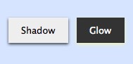
Recently, designers were just starting to get used to the fact that you can easily add shadows behind text. Internet Explorer doesn’t yet support the text-shadow property, but Safari and Firefox have for some time. But what’s really exciting is now you can add drop-shadows to boxes and controls using the box-shadow property. The syntax for box-shadow is much the same as text-shadow, which we describe below.
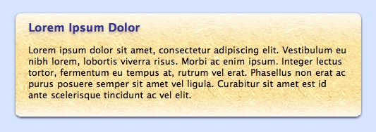
Gradients
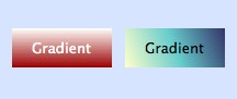
Wow! That is all done with CSS, no images required. Just so you realize how fast things are developing, CSS3 doesn’t actually specify a standard syntax for gradients yet, so currently there is one syntax used by WebKit (Safari, Chrome, etc.) and another used by Gecko (Firefox). We will explore both approaches in this article.
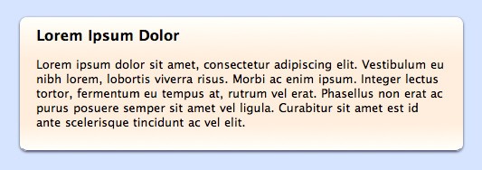
Borders with Rounded Corners
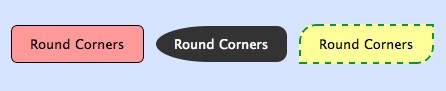
CSS has allowed several different border styles (double, inset, dotted, etc.) for some time, but now with CSS3 we have the ability to add a border radius to some or all corners. Yes, rounded corners are now possible without resorting to crazy JavaScript hacks or images! Another part of the CSS3 specification is border images, which is also interesting. It’s a rather complicated technique all by itself, so I will save that discussion for another time. You can read more about the spec at the W3C. How to Style Boxes
A good mindset to employ when using the latest CSS3 techniques is first to find an acceptable baseline style that is supported by incompatible browsers. We’ll cover some thoughts about older browsers or IE support later in this article, but the idea here is to style a box or page element without using shadows, rounded corners, gradients, etc. and see if you are reasonably happy with the result. If it looks decent, then you can go ahead and add all the nice eye candy with the knowledge that if someone is using a browser without the necessary CSS3 support, they’ll still have a reasonable experience.
For today’s example, we’re going to through three stages to add in our special styles.
Start with the Baseline
3 | border-top: solid 1px white; |
4 | border-bottom: solid 1px #669; |
5 | padding: 10px 18px 10px 18px; |
7 | font-family: "Lucida Sans MS", "Lucida Grande", Helvetica, sans-serif; |
This CSS code will get us started. Create a div and enter in some text, and you’ll see a basic box look.
Add Rounded Corners
As with most of these properties, we have to maintain more than one syntax to support multiple browsers (a real drawback currently). Since I develop first in Safari on the Mac, I’ll start with the WebKit version.
1 | -webkit-border-radius: 8px |
Aha! The corners are now rounded. Next, I’ll add the Gecko version:
When at all possible, always add the version without any prefix. That way you’re future proofing your style sheet in anticipation of the CSS3 final standard.
If you want to have additional control over the radius of each corner, use the border-[top-left|bottom-right|etc.]-radius syntax. Note that currently, the Gecko version is slightly different: -moz-border-radius-topleft, etc..
Add a Drop Shadow
Now, we’re going to add the drop shadow. If you’ve ever used the text-shadow property before, this syntax will look familiar.
1 | -webkit-box-shadow: 0px 1px 3px rgba(0,0,0,0.7); |
Now here you’ll notice I’m not using typical hex codes for the colors but am using the new rgba syntax. The first three integers are the expected 0-255 range of colors values, but the last one is a decimal number from 0.0 to 1.0 that represents the alpha value (literally the opacity of the color). The ability to specify semi-transparent colors is truly welcome and allows us to create shadows that work well on different backgrounds.
Again, don’t forget the alternative versions:
1 | -moz-box-shadow: 0px 1px 3px rgba(0,0,0,0.7); |
2 | box-shadow: 0px 1px 3px rgba(0,0,0,0.7); |
Adding a Gradient Fill
OK, this is where things are going to get tricky. The CSS3 spec for gradients is so new and undefined that there’s a completely different syntax whether you’re talking about WebKit or Gecko. I had to spend some time going back and forth between BBEdit and Safari to get it just right, and then when I switched over to Firefox, it took another while before I could figure out how to duplicate my results.
Gradients can be applied to a few common properties. Usually you’ll want to use background. Here’s the WebKit syntax:
1 | background: -webkit-gradient( |
3 | center top, center bottom, |
4 | color-stop(0%, #fffffa), |
7 | color-stop(100%, #fffffa) |
For each color-stop, you can use a percentage or a position value (px, etc.). I think percentage is nice because it will scale with the box.
The Gecko syntax is different in rather confusing ways, but requires less typing:
1 | background: -moz-linear-gradient( |
2 | top, #eef, #cce 30%, #cce 80%, #eef 100% |
I recommend starting with the background selector for the solid color, then do the WebKit version, then do the Gecko version, for a total of three background selectors. Browsers will go down the list and use the one that they understand.
Bonus Feature: gradients on top of images!
As you can see, the final product looks really nice. You can even stack multiple boxes on each other and see how the shadow effects and corners are drawn. But then I had an idea. I’d heard that CSS3 supports multiple backgrounds, so could I actually create a gradient with alpha transparency on top of a background image? The answer is: yes.
1 | background: -webkit-gradient( |
3 | center top, center bottom, |
4 | color-stop(0%, rgba(255,255,255,0.8)), |
5 | color-stop(30%, rgba(255,255,255,0)) |
7 | background: -moz-linear-gradient( |
8 | top, rgba(255,255,255,0.8), rgba(255,255,255,0) 30% |
The key is to specify the WebKit version with the gradient, followed by a comma, followed by the url to the image. And then do that all over again with the Gecko version. That provides us with a beautiful “shine” effect at the top of the box rendered directly on the image. With CSS3, you won’t have to worry about height-related image tiling issues for glows or shadows again!
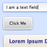
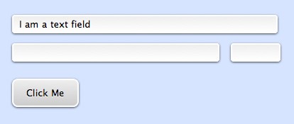
Styling Forms
Form styles can be tricky as browsers sometimes won’t render controls styled by CSS (they continue using the native OS’s UI elements). Or they use some of the selectors and ignore others. Generally, your best bet is to stick with text fields and buttons, and use Javascript-based custom controls for drop-downs, radio buttons, check boxes, etc.
Here’s an example of a couple of form elements styled using CSS3:
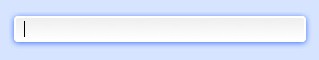
One cool thing I did was add extra styling for a “glow” ring when the form element has the focus using the :focus pseudo-class.
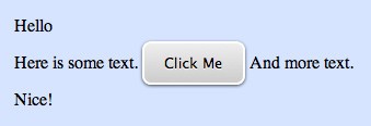
You can also create an awesome button using a single span tag. Check this out:
<p>Here is some text. <span class="roundbutton1">Click Me</span> And more text.</p>
What About Older Browsers?
The key with supporting older browsers or particularly Internet Explorer is to choose your battles carefully. Some designers will decide they need every user’s experience to be top-notch and so will eschew virtually all CSS3 effects in lieu of using images as before. Other designers may be so gung-ho about CSS3 that they forget that many users will not experience that great of a visual design.
What I recommend is to try as hard as you can to create elements using standard CSS2 syntax first. If you get to an acceptable place, then add the CSS3 effects you want. If you don’t find the baseline acceptable, then you’ll need to go the old-school way. If you go through this thought process with every element individually, then you’ll probably end up with a site design that has some elements done old-school for maximum compatibility, and other elements (perhaps less critical ones) spiffied up for the latest CSS3 browsers.
What doesn’t make sense is to spend time creating image-based versions, then creating alternative CSS3 versions. Yes, serving two different versions depending on the user’s browser could save a small amount of bandwidth, but I don’t see it as being worth the effort. Go with one version or the other and stick to that.


0 comments:
Post a Comment